Apothe~carry: The voice of now - Final project
3D Modeling
View 3D Scene Here
Isolated Canister Design Here

Brand/Logo Creation
Based on the Demographic I put together a Stylescape based on color exploration, lifestyle pictures, interests around our target Demo, and typographic studies. Think of a Stylescape as the Graphic designers version of an interior designers mood board, just setting the whole brand vibe.
The Brand Design was built in tandem with the Product Design
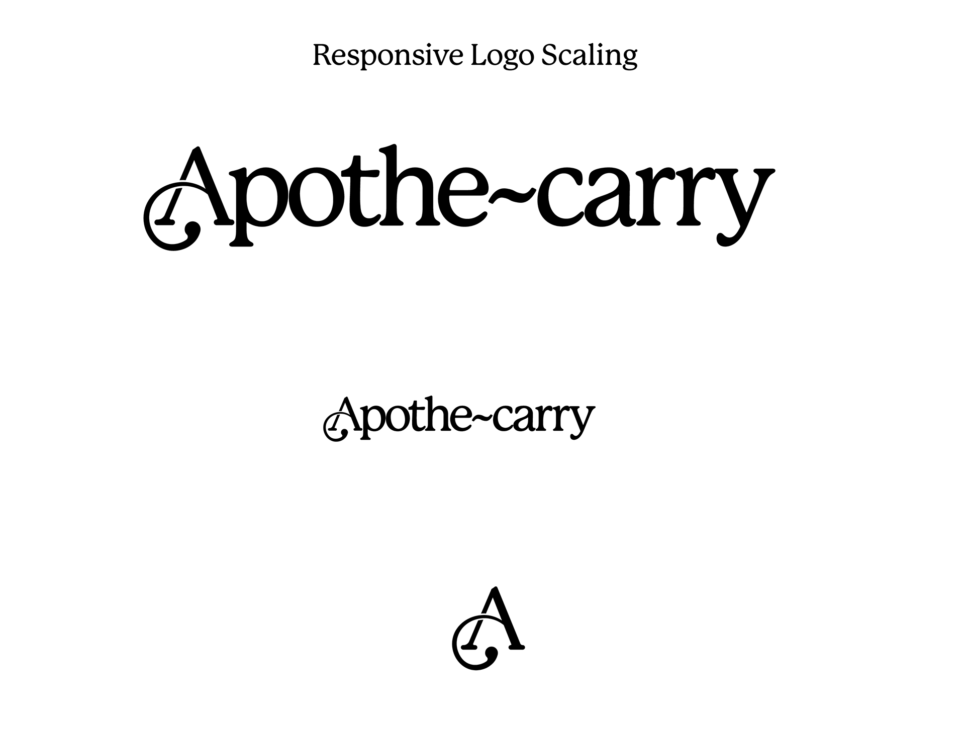
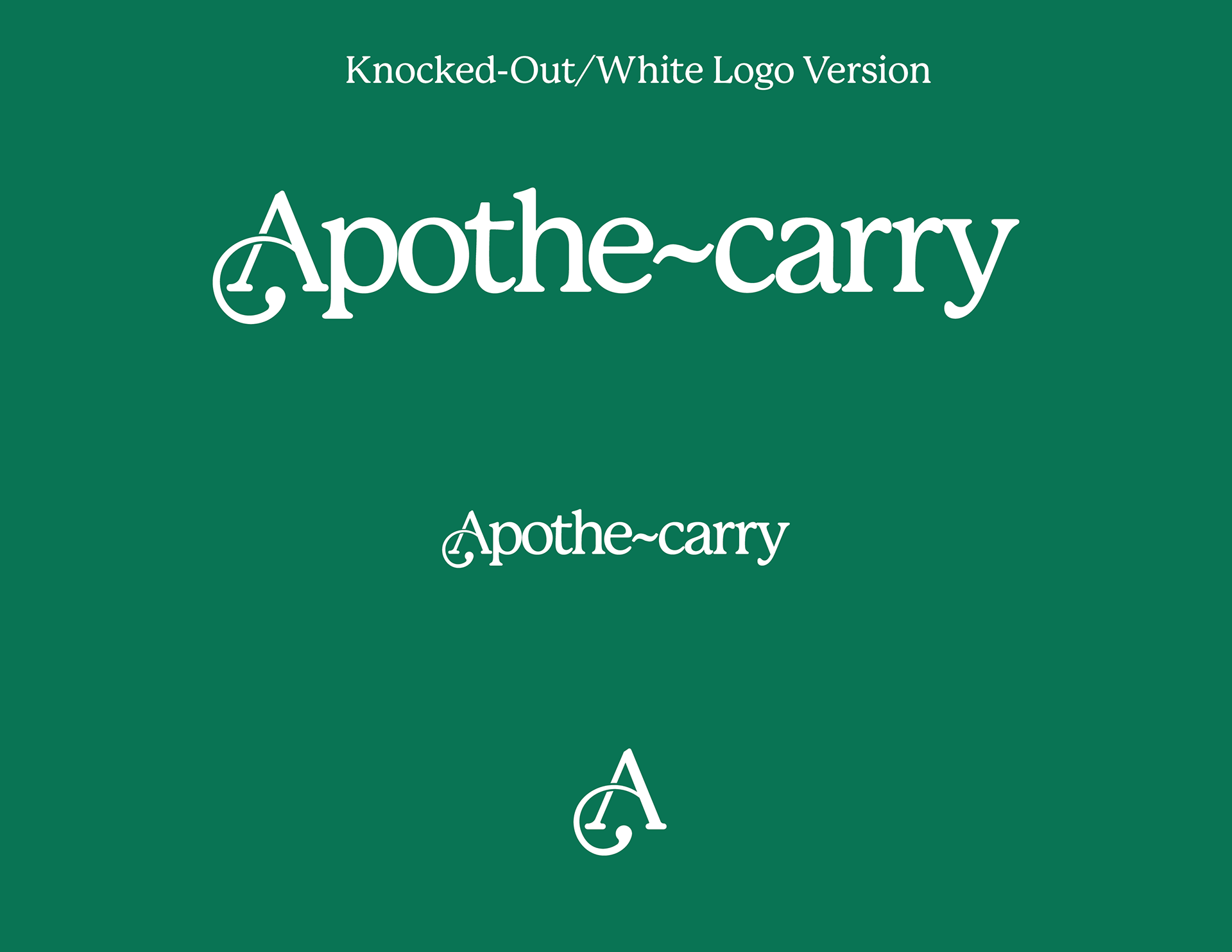
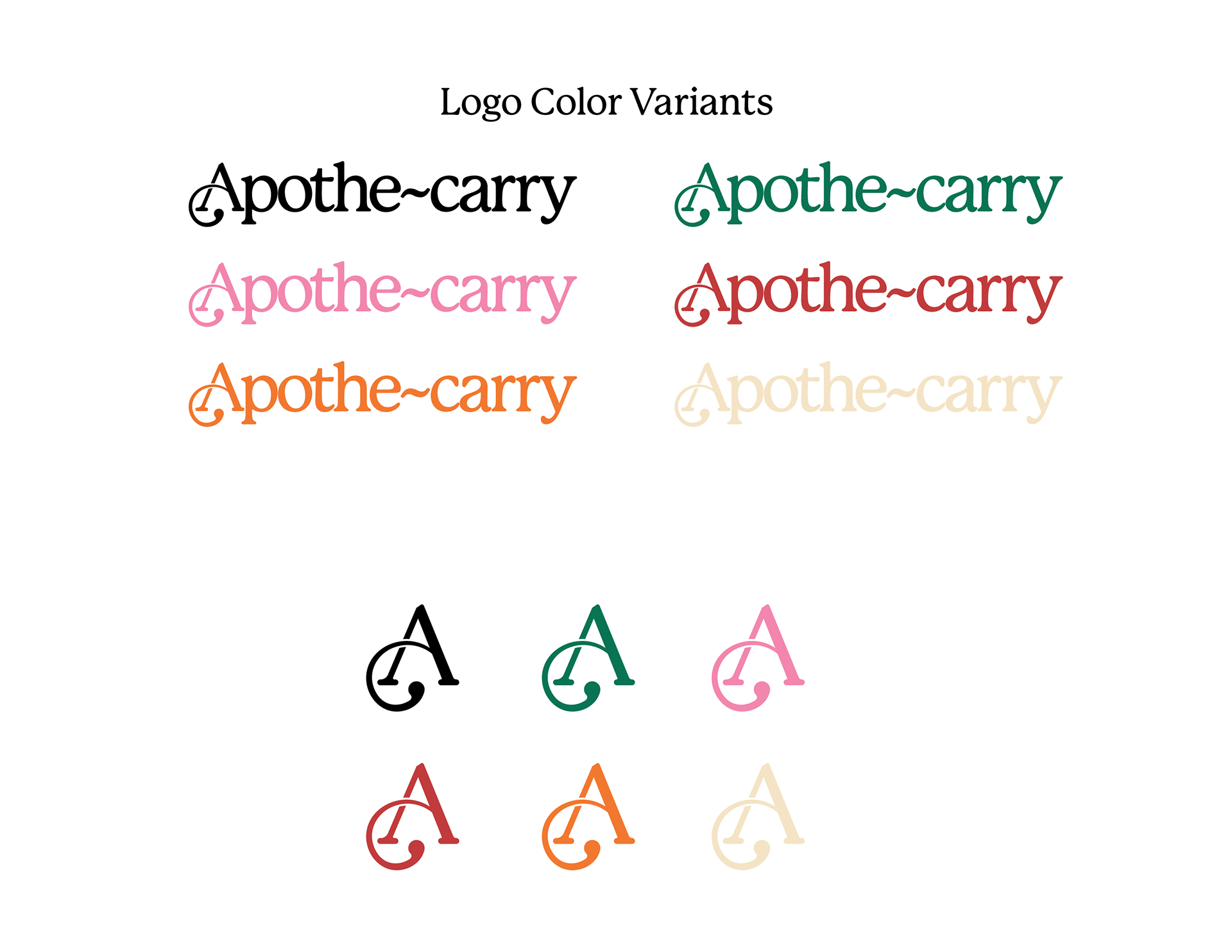
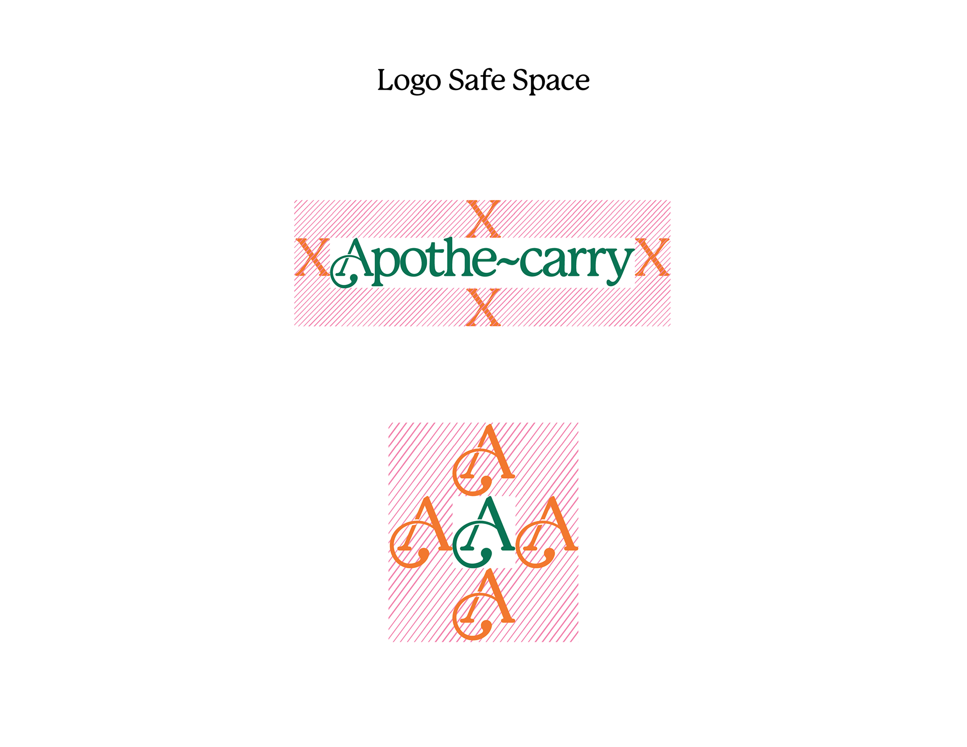
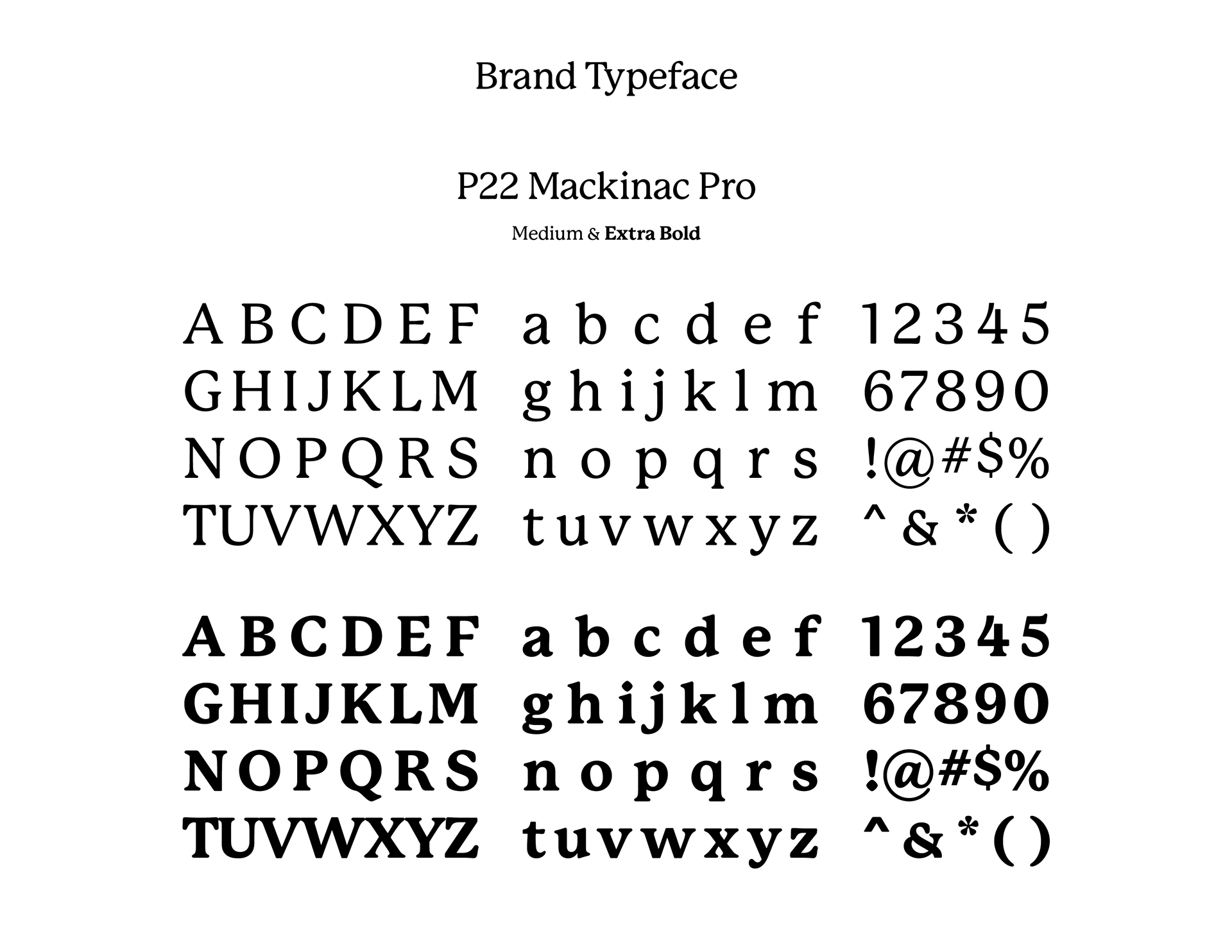
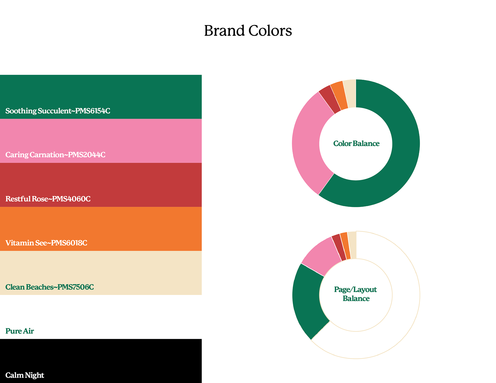
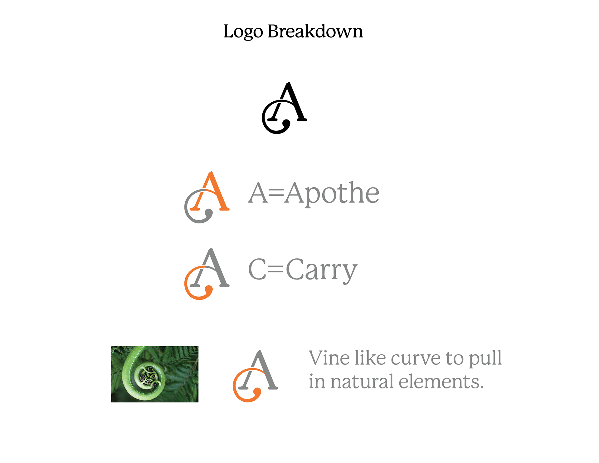
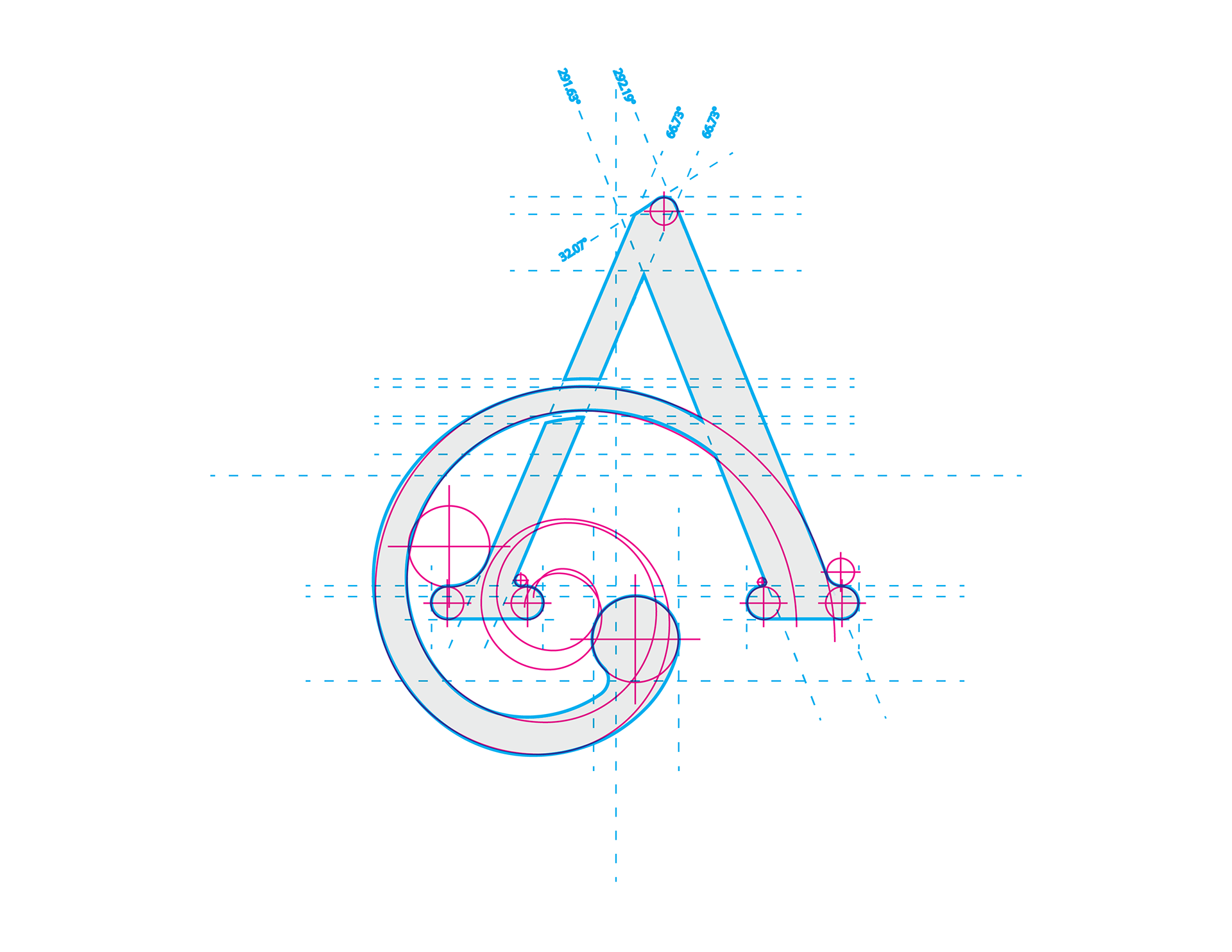
P22 Mackinac Pro was used as a base for a warm and welcoming brand touch, similar to how hims & hers prescription brand. Color palette was influenced by nature and femininity. Also, what better way to stand out in sea of sans serifs than with a nice humanist inspired typeface.
Prescription/FDA Redesign for Visually impaired
According to research done by Hubspot, these are the best accessible fonts for visually impaired audiences: OpenDyslexic (no thanks), Arial (The poor persons Helvetica), Helvetica Neue (Designers beige and vanilla), & Verdana (pass). With this said there is a more recent font created by the Braille Institute to help those with vision issues see more clearly and it is called Atkinson Hyperlegible. I mean it's not just Legible, it's Hyper legible, what's not like here?! But honestly they made some really smart choices on this Font to help with legibility.
Redesigned labels with color vision impairment and color blindness consideration.
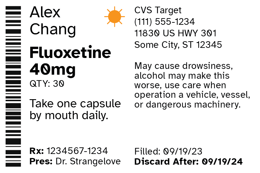
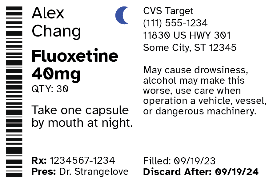
Anatomy and Hierarchy of New Label Design
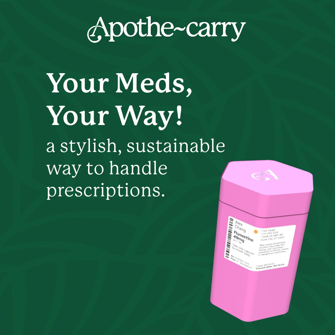
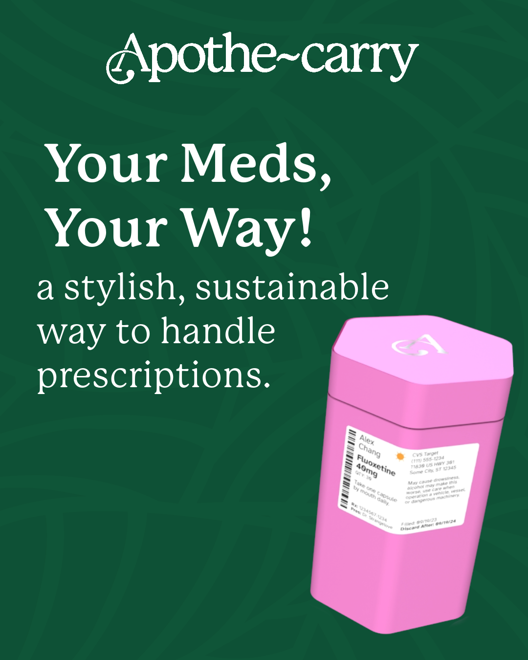
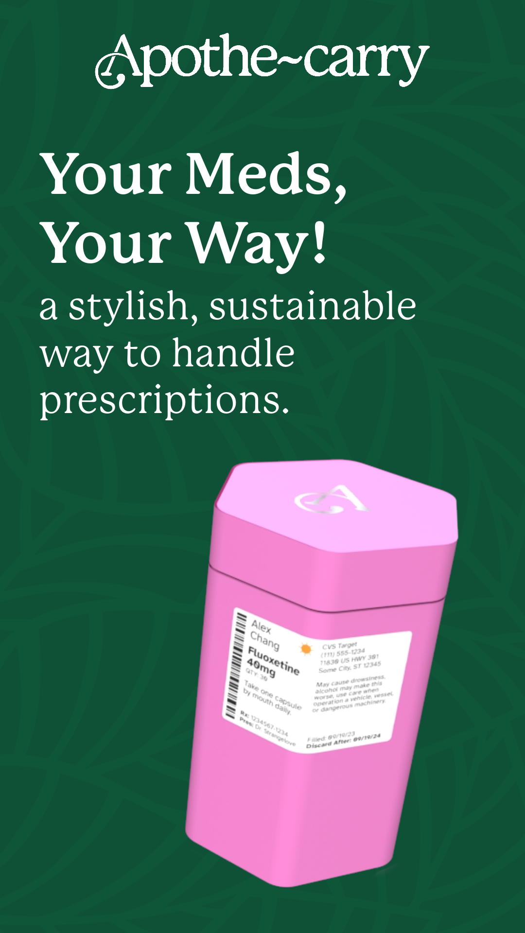
Magazine Ad

These ads would be in key publication that are target demographic purchase regularly like InStyle, Cosmo, Good House Keeping, et al.
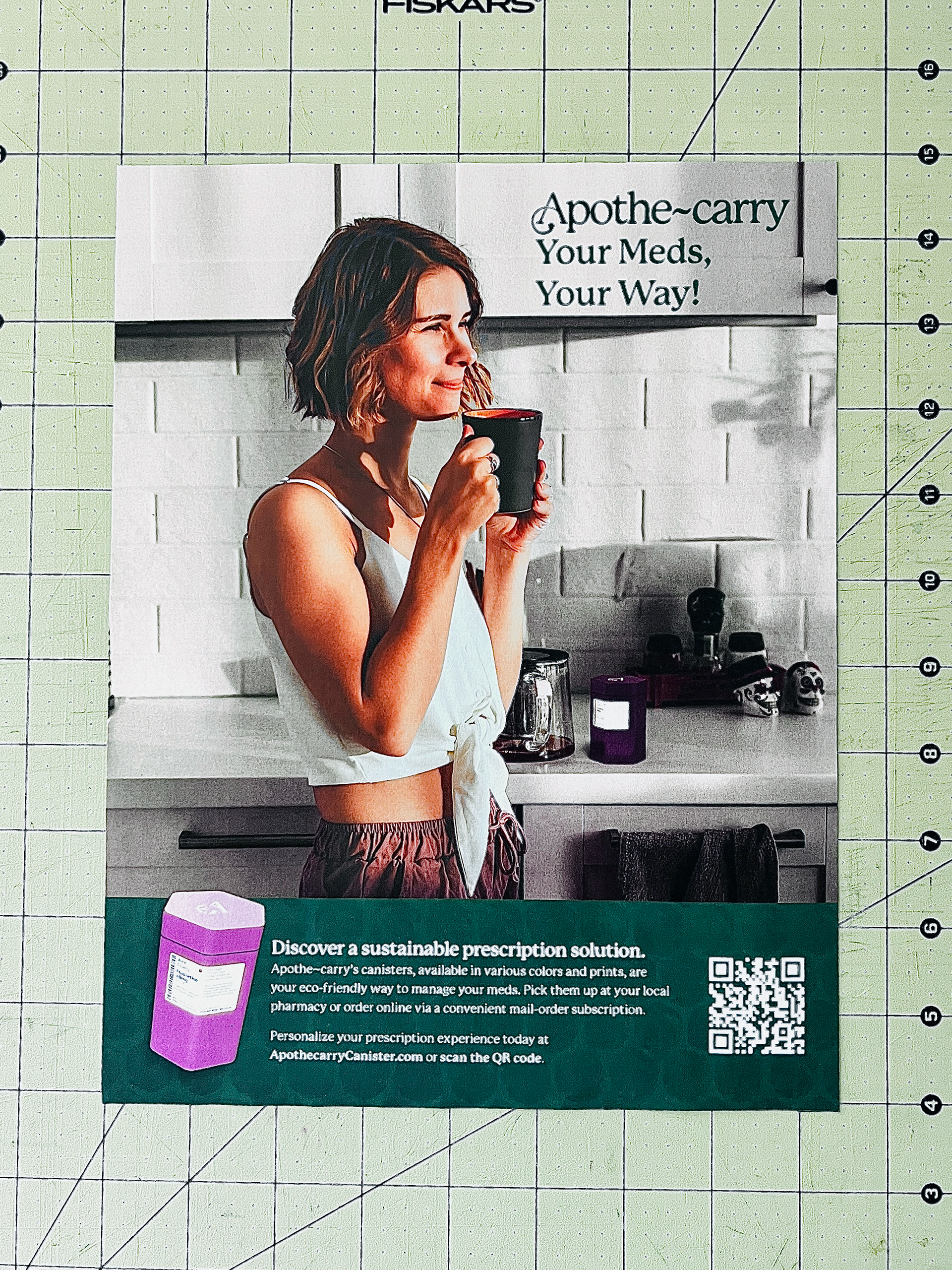
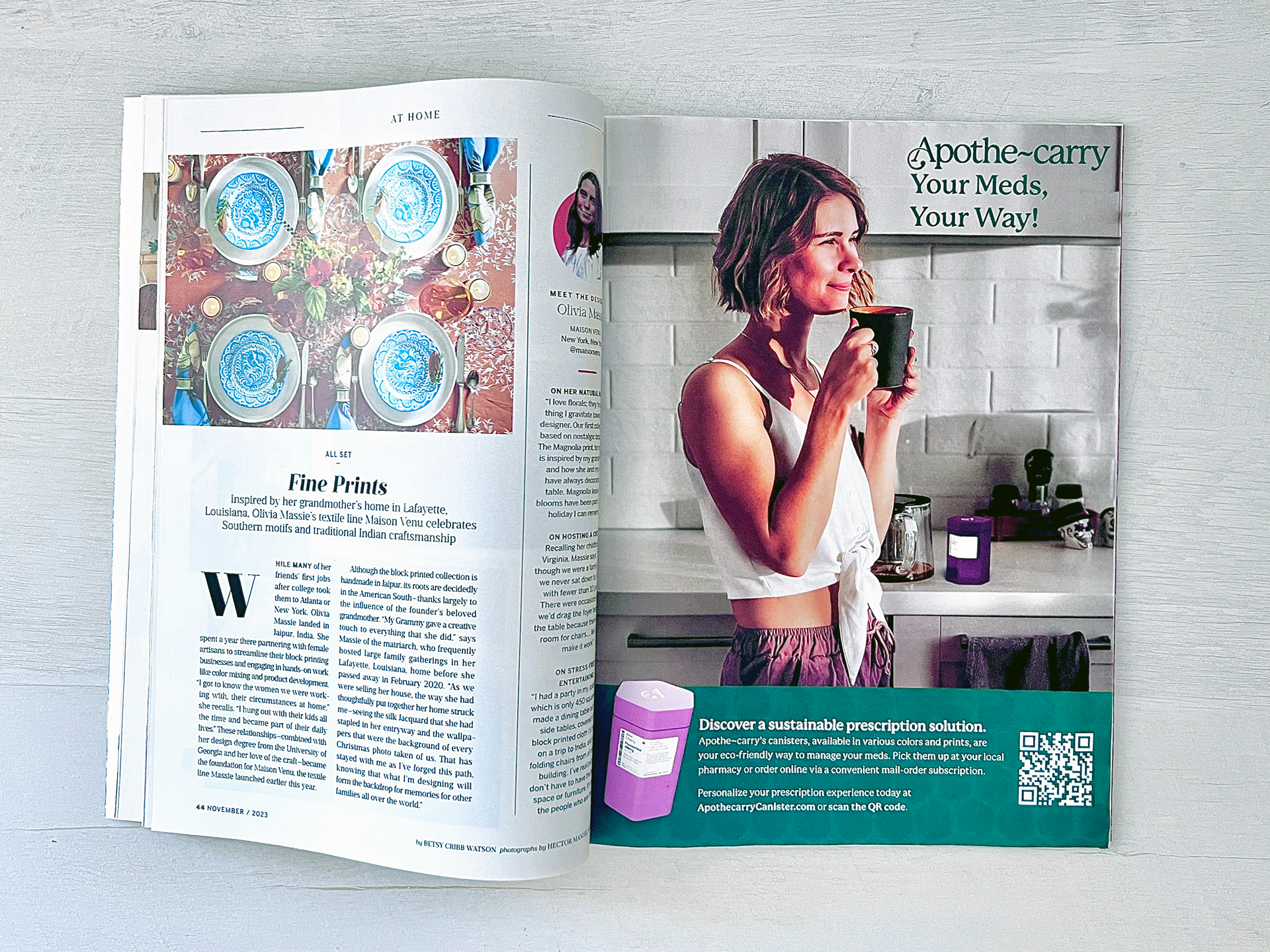
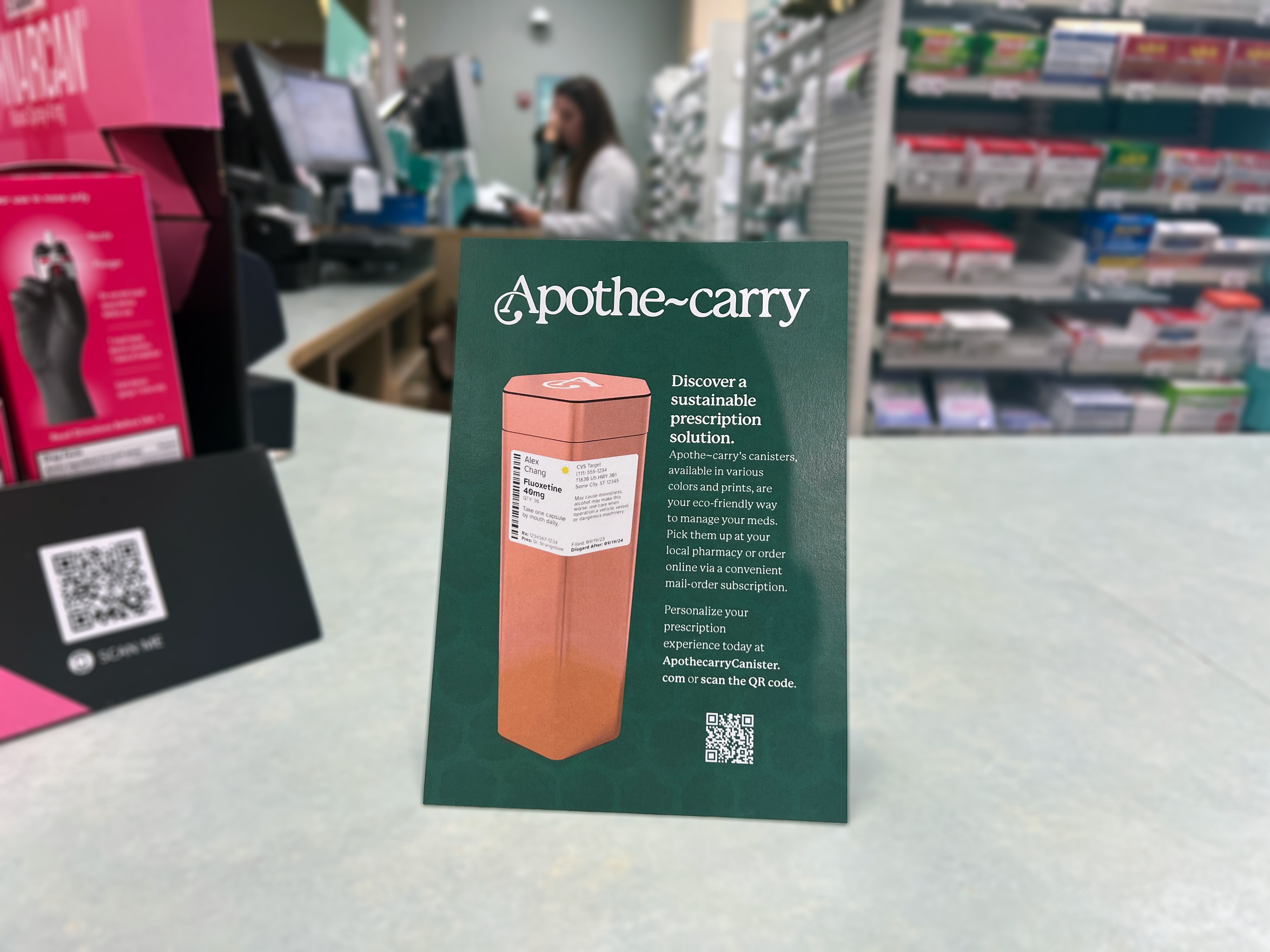
Pharmacy Table Tent Pop-Up Display
Social Media Ads — Static
